
Choosing the perfect paint color for your living room can set the tone for your entire home. While trends come and go, some colors might seem appealing at first but could quickly become a source of regret. It’s essential to consider both aesthetics and practicality when selecting a shade.
Some hues may clash with your furniture, make the space feel smaller, or just become overwhelming over time. In this article, we’ll highlight five paint colors that interior designers often advise against using in living rooms. By avoiding these colors, you can create a more harmonious and timeless space that you’ll love for years to come.
1. Vibrant Red
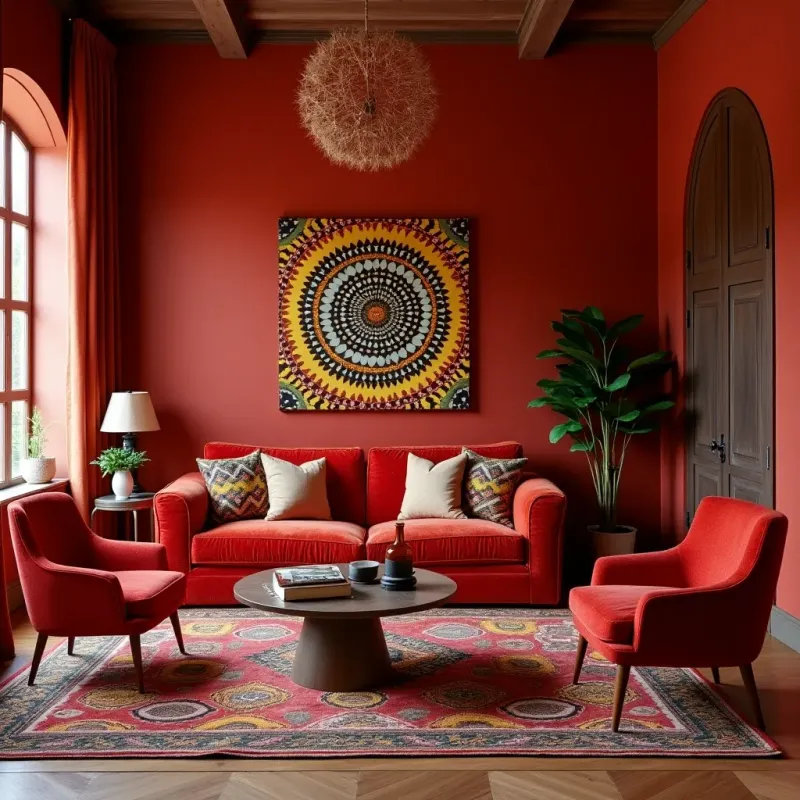
Vibrant red, while eye-catching, can be overwhelming in a living room setting. Designers caution against its use due to its intense nature. The color can dominate the space, making it hard to relax. Even though red can evoke emotions of warmth and comfort, it often does the opposite in large doses.
In smaller living rooms, it can make the area feel cramped and claustrophobic. Instead of a welcoming vibe, you might end up with a room that feels aggressive. Consider using red as an accent rather than the primary color to avoid these pitfalls.
2. Dark Brown

Dark brown can make a living room feel enclosed and somber. While it’s often associated with earthiness and stability, it can absorb light excessively. This can lead to a space that feels unwelcoming and dreary.
If your living room doesn’t get ample natural light, dark brown can make the space seem even darker. To avoid this effect, consider using lighter shades that can reflect light and open up the room. Dark brown might work better for smaller accents or furniture pieces.
3. Neon Green
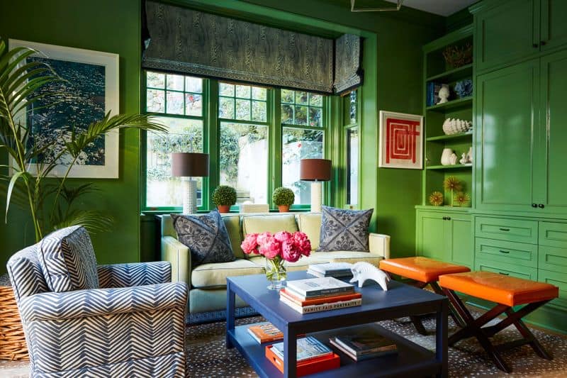
Neon green, though trendy, tends to overpower a living room. It’s a bold choice that can lead to visual fatigue quickly. The brightness of the color can distract from other design elements in the room.
Designers often recommend opting for softer greens that provide tranquility without overwhelming the senses. A living room should ideally be a place of relaxation, and neon green can work against that goal. Balancing this color with neutral tones can help mitigate its intensity.
4. Bright Yellow
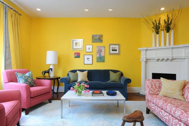
Bright yellow is known for its cheerful vibe, but it might not be the best choice for living rooms. Its intensity can become jarring over time. In spaces with a lot of natural light, bright yellow can create glare, leading to discomfort.
Instead of painting all the walls bright yellow, consider using it sparingly. Accents like cushions or art pieces can provide the desired pop of color without overwhelming the space. Balancing it with cooler tones can help neutralize its impact.
5. Black
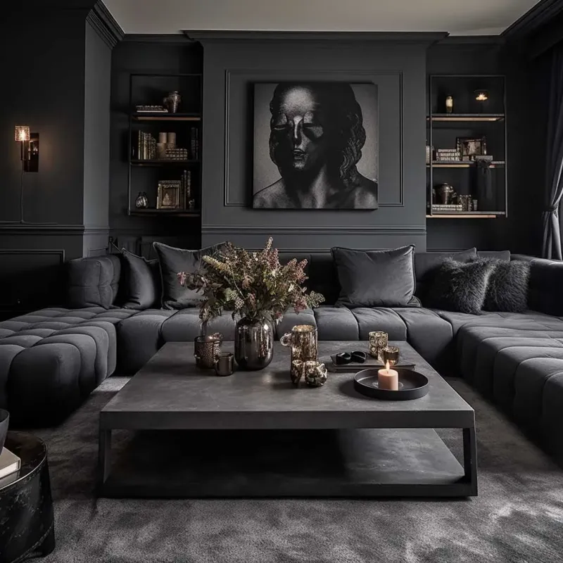
Black, though elegant and chic, can be a risky choice for living rooms. It tends to absorb light, making the room appear smaller and less inviting. While it adds sophistication, it can also create a heavy atmosphere that might not be ideal for relaxation.
If you’re drawn to black, consider using it as an accent color or on one feature wall. This approach retains the drama without compromising the room’s ambiance. Pairing black with lighter colors can also help balance the overall look.

Well, hello there!
My name is Jennifer. Besides being an orthodontist, I am a mother to 3 playful boys. In this motherhood journey, I can say I will never know everything. That’s why I always strive to read a lot, and that’s why I started writing about all the smithereens I came across so that you can have everything in one place! Enjoy and stay positive; you’ve got this!